Colour & Pattern Selection
Colour & Pattern Selection for Interior Design
When it comes to interior design, the selection of colour and pattern plays a crucial role in defining the overall mood, atmosphere, and functionality of a space. The choices you make regarding these elements will significantly influence the way a room feels and how people interact with it.
The Power of Colour in Interior Design
Whether you’re designing a cozy living room, a vibrant kitchen, or a calm bedroom, understanding how to strategically use colour and pattern can help you create the perfect environment.
In this article, we will explore the importance of colour and pattern selection in interior design, discuss the practical considerations that should guide your choices, and offer advice on how to use neutral tones, bold colours, and patterns effectively.
Colour is one of the most powerful tools available to a designer. It can dramatically alter the perception of space, evoke emotions, and even influence people’s behaviour. The psychology of colour is well-documented, with certain hues known to inspire calm, creativity, energy, or warmth.
When selecting colour for a space, the following aspects should be considered:

Neutral Tones: Timeless and Versatile
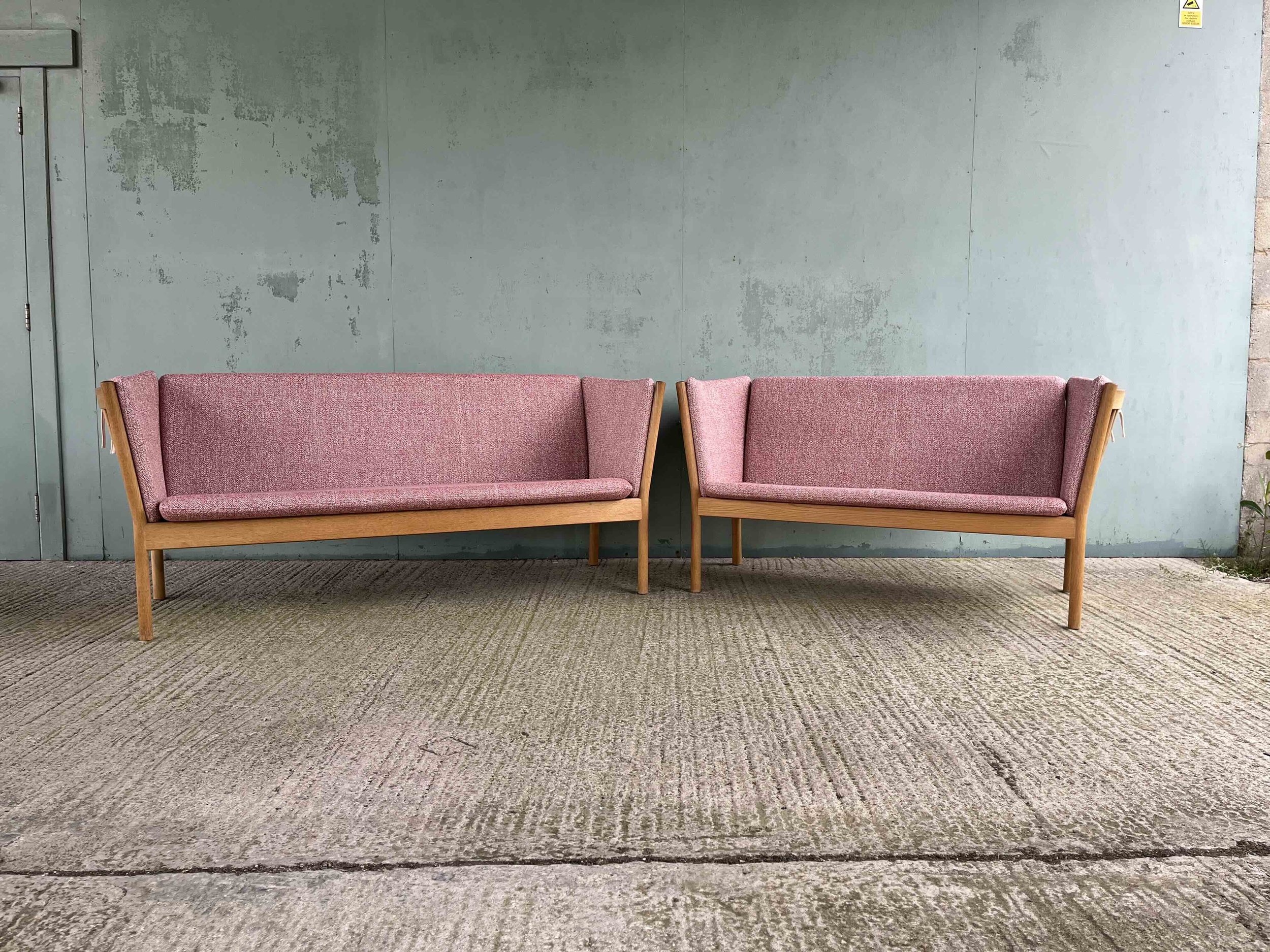
Neutral colours such as whites, grays, beiges, taupes, and soft browns are staples in interior design because they are timeless and versatile. These shades work well in a variety of spaces and are suitable for various design styles, from minimalist and modern to traditional and rustic. Neutral tones serve as a neutral backdrop, allowing other design elements such as furniture, artwork, and accessories to stand out.
For example, light grey walls can complement virtually any piece of furniture, from a sleek leather sofa to a vintage wooden coffee table. In contrast, darker neutrals, such as charcoal or navy, can create a more sophisticated and intimate atmosphere. Neutral tones also have the advantage of being easy to pair with other colours and patterns, making them ideal for creating a cohesive design.
Neutral tones also possess a practical side: they are less likely to go out of style. When you opt for neutral colours for walls, floors, or larger furniture pieces, you create a timeless foundation that can adapt to changing trends over time. The flexibility of neutral tones means that as fashion and tastes evolve, it’s simple to update the look of a room with new accessories or furniture without needing to repaint or completely redesign the space.

2. Bold Colours: Creating a Statement
On the opposite end of the spectrum, bold colours such as deep blues, vibrant reds, mustard yellows, and rich greens have the power to create statement pieces in a space. These colours can add personality, warmth, and excitement, making them an excellent choice for feature walls, accent furniture, or statement accessories. Bold colours can energize a space and evoke strong emotional reactions, making them perfect for rooms designed for socializing, such as living rooms or dining areas.
However, it is important to use bold colours strategically. Because they are intense, they can overwhelm a room if used excessively. Consider limiting the use of bold colours to smaller areas, such as an accent wall, a colourful rug, or vibrant throw pillows. A bold colour choice on a single wall or an accessory can make a dramatic impact without overwhelming the space. In this way, the bold colour acts as a focal point, drawing attention and creating visual interest.
When selecting colour for a space, the following aspects should be considered:
1. Neutral Tones: Timeless and Versatile
Neutral colours such as whites, grays, beiges, taupes, and soft browns are staples in interior design because they are timeless and versatile. These shades work well in a variety of spaces and are suitable for various design styles, from minimalist and modern to traditional and rustic. Neutral tones serve as a neutral backdrop, allowing other design elements such as furniture, artwork, and accessories to stand out.
For example, light gray walls can complement virtually any piece of furniture, from a sleek leather sofa to a vintage wooden coffee table. In contrast, darker neutrals, such as charcoal or navy, can create a more sophisticated and intimate atmosphere. Neutral tones also have the advantage of being easy to pair with other colours and patterns, making them ideal for creating a cohesive design.
Neutral tones also possess a practical side: they are less likely to go out of style. When you opt for neutral colours for walls, floors, or larger furniture pieces, you create a timeless foundation that can adapt to changing trends over time. The flexibility of neutral tones means that as fashion and tastes evolve, it’s simple to update the look of a room with new accessories or furniture without needing to repaint or completely redesign the space.
2. Bold Colours: Creating a Statement
On the opposite end of the spectrum, bold colours such as deep blues, vibrant reds, mustard yellows, and rich greens have the power to create statement pieces in a space. These colours can add personality, warmth, and excitement, making them an excellent choice for feature walls, accent furniture, or statement accessories. Bold colours can energize a space and evoke strong emotional reactions, making them perfect for rooms designed for socializing, such as living rooms or dining areas.
However, it is important to use bold colours strategically. Because they are intense, they can overwhelm a room if used excessively. Consider limiting the use of bold colours to smaller areas, such as an accent wall, a colourful rug, or vibrant throw pillows. A bold colour choice on a single wall or an accessory can make a dramatic impact without overwhelming the space. In this way, the bold colour acts as a focal point, drawing attention and creating visual interest.
3. Pastels and Soft Tones: Subtle Elegance
In addition to neutral and bold colours, pastels and soft tones also have a significant role in interior design. Light pinks, lavenders, pale blues, and mint greens bring a subtle elegance to a room, offering a sense of calm and serenity. These hues are particularly well-suited for bedrooms, bathrooms, and nurseries, where a soothing environment is desired. Pastels can also work well in larger spaces when combined with neutral tones, creating a soft, airy feel.
Pastels and soft tones are often used in combination with other colour schemes to balance out more intense colours. For instance, a pastel pink accent wall may work beautifully alongside neutral-colored furniture and accessories, creating a harmonious and relaxing atmosphere.
The Role of Patterns in Interior Design
While colour sets the foundation for a space, patterns add visual interest and texture. They can be used to inject character, depth, and creativity into your design. The type of pattern you select can convey different aesthetics, from geometric and minimalist designs to floral or botanical prints. Patterns also help to create a dynamic visual flow, breaking up large expanses of solid colour and adding complexity to the space.
1. Geometric Patterns: Modern and Bold
Geometric patterns, such as chevrons, stripes, or hexagons, are popular choices for creating a modern and bold look. These patterns are often used in contemporary and minimalist interiors to add structure and visual interest. Geometric patterns work particularly well on accent walls, area rugs, and throw pillows, where they can serve as a striking focal point.
In addition to their visual impact, geometric patterns can also be used to enhance the perception of space. For example, horizontal stripes can make a room feel wider, while vertical stripes can make it feel taller. The key with geometric patterns is to maintain balance; if the design is too busy, it can overwhelm the space. Using geometric patterns sparingly and pairing them with solid colours helps to create a sophisticated and modern aesthetic.
2. Floral and Botanical Patterns: Soft and Inviting
Floral, botanical, or nature-inspired patterns bring a touch of softness and organic beauty to a space. These patterns work well in spaces where a calming and natural ambiance is desired, such as bedrooms, living rooms, or even bathrooms. Floral prints can range from delicate, small-scale patterns to bold, large-scale designs, depending on the overall look you wish to achieve.
Floral patterns can evoke a sense of nostalgia and warmth, making them ideal for more traditional or vintage-inspired interiors. In more contemporary spaces, modern interpretations of floral patterns, with stylized or abstract designs, can create a chic and playful vibe. As with all patterns, it’s important to balance the use of floral designs with other elements to avoid overwhelming the space.
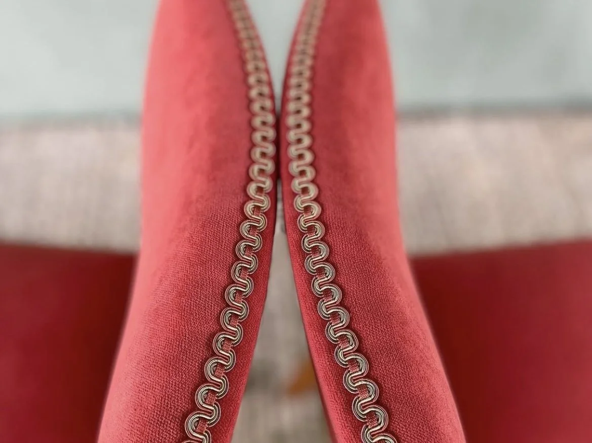
3. Textured and Abstract Patterns: Adding Depth
Patterns don’t always have to be literal. Abstract or textured patterns—such as woven fabrics, raised textures, or irregular shapes—add depth and visual interest to a room without distracting from the overall aesthetic. These patterns are especially useful in spaces where you want to add texture without overwhelming the design with bold prints.
For example, a neutral-toned sofa with a textured fabric can provide a subtle yet sophisticated effect, allowing the other design elements in the room to shine. Textured patterns are also excellent for creating a sense of tactile comfort in a space. Materials such as velvet, linen, or wool naturally bring texture and visual richness, while abstract patterns can add a touch of artistic flair.
Practical Considerations: Stain Resistance and Durability
While colour and pattern play an important aesthetic role in interior design, practical considerations such as durability and maintenance should not be overlooked. The choice of fabric or material can impact the longevity of your design choices and the amount of care required to keep them looking fresh.
1. Stain Resistance: Managing Wear and Tear
When choosing fabrics and colours, it’s important to think about how they will age over time. Lighter colours, such as beige, white, or pastel tones, can show dirt and stains more easily, making them less practical in high-traffic areas or homes with young children or pets. While these colours can create a serene and inviting atmosphere, they may require more maintenance to keep clean and looking fresh.
Darker colours and patterned fabrics are often better at concealing dirt, stains, and wear over time. A patterned fabric, for instance, can hide minor stains and make a piece of furniture look newer for longer. Similarly, darker tones, such as deep browns, charcoal, or navy, can help mask everyday wear and tear, especially in high-use areas like living rooms and dining rooms.
In addition to colour, fabric choice plays a significant role in stain resistance. Materials such as microfiber, leather, and synthetic fabrics tend to be more durable and easier to clean than delicate materials like silk or linen. If you’re designing a space with practicality in mind, it’s worth considering stain-resistant materials that will stand the test of time without compromising on style.
2. Long-Term Durability: Choosing Quality Fabrics
It’s essential to choose fabrics that not only complement the colours and patterns of your design but also withstand the wear and tear of daily life. Investing in high-quality fabrics, such as wool, leather, or high-performance synthetics, ensures that your furniture and textiles remain durable and look good for years to come. These materials are often more resilient to fading, pilling, and general wear, making them suitable for both high-traffic areas and more delicate spaces.
When selecting fabrics, also consider the amount of sunlight the room receives. Direct sunlight can cause colours to fade over time, especially lighter shades. Choosing fabrics and patterns that are fade-resistant, or using window treatments to reduce direct sun exposure, can help preserve the vibrancy of your chosen colours and patterns.

Conclusion: Creating a Cohesive and Eye-Catching Design
The selection of colour and pattern is a fundamental aspect of interior design that influences both the aesthetic appeal and functionality of a space. Whether you opt for timeless neutral tones, bold statement colours, or intricate patterns, each choice you make should contribute to the overall vibe and purpose of the room.
Neutral tones provide a versatile foundation that allows other design elements to shine. Bold colours and patterns create focal points that draw attention and add excitement. The key is to balance these elements in a way that supports your vision for the space while considering practical concerns like stain resistance and durability. By carefully selecting colours and patterns, you can create a cohesive and eye-catching design that enhances the beauty and function of any room in your home.